Google has some pretty big products that shape our lives as we use them every day. There is, of course, the search engine that embodies the internet as a whole, but other huge products include Google Chrome, Gmail, and Google Maps. With so many massive Google products making the rounds, it is easy to forget about some of Google’s smaller products. Google Keep is one such product. And it’s better than ever after a massive overhaul.
Google Keep is now Keep Notes and looks a lot like other Google apps, thanks to its latest update
Google Keep has been one of the best note-taking apps available on Android. It has been a while, however, since it last got a lick of paint. This is finally about to change, thanks to update version 5.0.411.09, which will bring Keep in line with Google’s Material Design philosophy.
This change aligns Keep with a wide range of other Google apps that have already been subject to the Material Design UI update, including Google Photos, Google Drive, and Google Calendar.
4 extremely useful Google apps you probably don’t know about
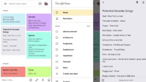
READ NOW ►The update makes Keep look cleaner and more modern. Cards now have rounded corners and stand out much more against a white backdrop, as opposed to the old grey background with squared corners on cards. The search bar is now whiter than it was before, but still acts the same as it always has. Users still have control over the color scheme of their own version of Google Keep, so if white isn’t your thing, you can change it up. The other big change is the name. Keep is now called Keep Notes.
Apart from the new design and name change, the latest Keep Notes update doesn’t bring any new features. The update is merely cosmetic to bring Keep Notes in line with Google’s singular design philosophy for all its products.
The update has already begun rolling out to all Keep Notes users, but it is being done in stages. You’ll know if you’ve received the update as the name of the app on your phone will have changed from Keep to Keep Notes. If you haven’t already received it, don’t worry, it is on its way.
What do you think about Google’s new Material Design philosophy? Do you think it adds a new modern flair to Google’s apps or do you have a problem with a layout for serious apps that could be described as a little cartoony? Let us know in the comments below.

