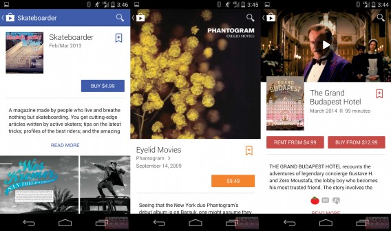
Google showed off its Material Design design language at Google I/O a few weeks ago and now we’re seeing it appear in Google Play. Android Police has exclusive screenshots of a pre-release version of Google Play, showing the impending redesign.
Material Design focuses on adding visual depth to the interface using layers. Android’s current design is extremely flat, but Material Design with change this with layers of content.
For example, take a look at the difference between the app page for Leo’s Fortune:

Image credit: Android Police – Left: Material Design; Right: old design
The old design displays videos and screenshots all on the same panel. The new displays different media in different ways. The trailer located at the top where the banner takes up almost the entire screen. Information and the install button are located on a layer above the full-page banner.
The redesign also affects pages for books, movies, music, and newsstand.

Image credit: Android Police
While Material Design doesn’t change or add any functionality to Google Play, it does make exploring content easier. The new layout is clear and concise where the old one inundated users with tons of text.
These leaked screenshots are a pre-release version so the final product may look different. There’s no information about when we can expect to see this redesign roll out but it makes sense to debut it with Android L, which is expected some time this fall.
Source: Android Police


