Google Maps, a crucial application in the lives of hundreds of millions of people worldwide, is also subject to criticism from its former developers. In fact, a former designer who worked with Maps in the past has expressed her dissatisfaction with the significant changes that have recently been made to the application.
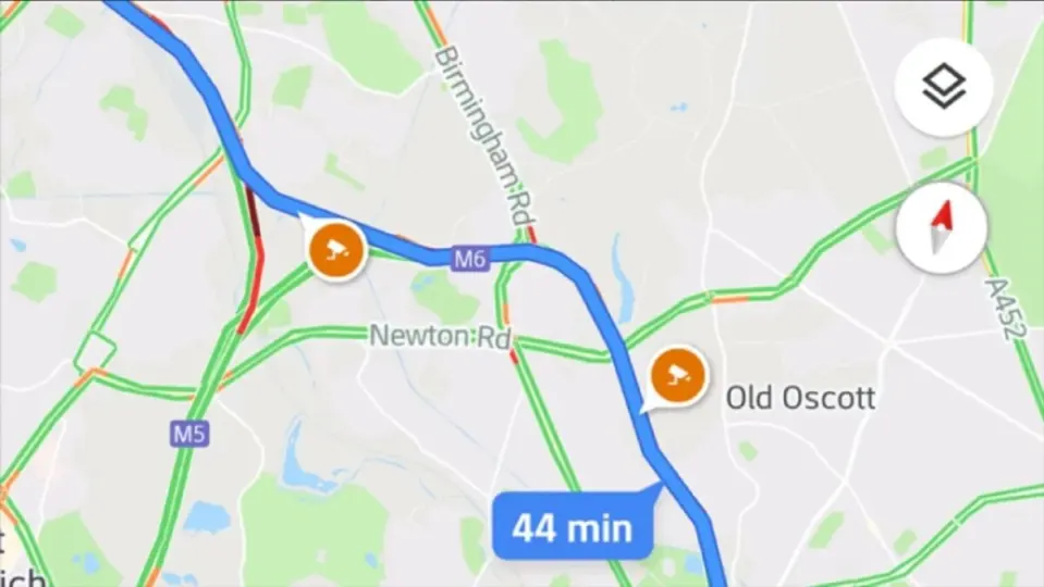
The Google Maps application, which was recently revamped to change its appearance and, above all, its color palette design, has generated varied opinions among users. It’s worth noting that one of the most critical voices is that of a former employee who laments the changes in Maps, considering them cold and bland.
Discontent with the new Maps
Elizabeth Laraki is the author of these criticisms made through Twitter, where she thoroughly examined the changes made by Maps and the elements that, in her opinion, would have been better left unaltered. Among other things, for example, she disagrees with the gray color of the roads, which stands out less than the orange that had always prevailed in Google Maps roads.
On the other hand, she is also dissatisfied with the new color palette, where the blue of the sea turns into an almost turquoise blue, and the green of the areas has become a more ‘mint green’ tone, thus prevailing the more subdued and minimalist tones than have been seen previously in the application. Laraki believes that these changes strip Google Maps of its personality and make it less ‘human’.

Maps and its new design
This new design for Maps is not implemented by chance, but because Google wanted its maps, location, and GPS application to align with the design standards that have become popular in recent years: soft tones, simple environments, and usability over aesthetics. That’s why, even though it may seem less ‘human’ to many, the usability improvements of the application outweigh the aesthetic loss.
For over 15 years, Google Maps has been illustrating maps worldwide, covering a vast number of roads in every country, and documenting businesses and points of interest that can be directly marked as a route from the application. Additionally, it is also being updated in line with advancements such as Artificial Intelligence to continually enhance the user experience.