News
Believe it or not, Google has just changed the name of its Android operating system
The name change is from "android" to "Android," quite surprising!

- September 7, 2023
- Updated: July 2, 2025 at 1:18 AM

Many people think that Apple’s mobile operating system, called iOS, is the most widely used in the world because Apple often tops sales charts. However, the reality is different, with Android dominating with a 71% market share.
In the end, Android is Google, Xiaomi, Samsung, Realme, Motorola, Poco, Redmi, Nothing, and the list goes on for hours. That’s why 7 out of 10 smartphones run on Android.
Well, and we say Android because now, after more than 15 years of existence, it’s called Android, not android.
A minor but very significant change
Google may have considered that 12,000 of its employees were surplus, but it’s clear that the search and advertising giant has kept a lot of designers on staff, and someone has found the time to redesign the logos of the Android operating system and its associated embellishments.
The last time Android received a refresh was in 2019 when Google decided to change colors and names that weren’t accessible to everyone.
Dessert-themed names were dropped for new versions of the operating system, and some green elements were changed to black to assist people with visual impairments.
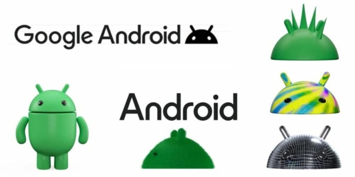
This time, Google believes that the global population of three billion Android devices should be reflected in logos that “capture the core spirit of Android being open, iterative, and inclusive.”

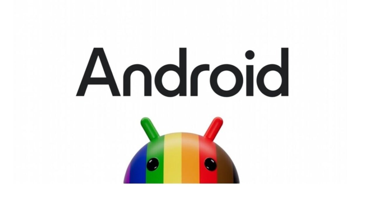
The new logo has been designed to “complement Google’s brand palette” by adding an uppercase A to the operating system’s logo. You can see it above these lines.
Jason Fournier, Director of Android Consumer Brand Management, says that the change elevates the logo and gives it “more weight in its appearance when placed next to the Google logo.”
Although in Spanish, we typically capitalize the first letter of all brand names and proper nouns, this is not the norm in English. That’s why the change is quite noticeable at Google’s offices in Mountain View.
Some of the links added in the article are part of affiliate campaigns and may represent benefits for Softonic.
Journalist specialized in technology, entertainment and video games. Writing about what I'm passionate about (gadgets, games and movies) allows me to stay sane and wake up with a smile on my face when the alarm clock goes off. PS: this is not true 100% of the time.
Latest from Chema Carvajal Sarabia
You may also like
 News
NewsThe most interesting indie of the year puts us in the shoes of a crystal demon who skateboards
Read more
 News
NewsAccording to the author of Percy Jackson, the series is more faithful to his books than the movies
Read more
 News
NewsMike Tyson took almost 30 years to discover that an iconic video game character was inspired by him
Read more
 News
NewsWarner Bros. is strongly opposed to Paramount's hostile takeover bid
Read more
 News
NewsCon 26 años a sus espaldas, esta franquicia de juegos de estrategia y RPG anuncia la fecha de lanzamiento de su nueva entrega
Read more
 News
NewsWhat is Fantastic Frontiers? The new trend that Adobe Firefly helps you create effortlessly
Read more