News
Facebook changes its logo after nearly a decade: the change is impressive…
It's not worth laughing; it's a change...

- September 21, 2023
- Updated: March 7, 2024 at 2:29 PM

For many of us, social media began with Facebook. The company created by Mark Zuckerberg on February 4, 2004, changed the way we connect forever. That’s why today’s news is so important, just like the news about Android a few weeks ago.
And it’s because Meta is updating the “identity system” of Facebook, and that includes a “radically refreshed” logo. Now you’ll understand the quotation marks.
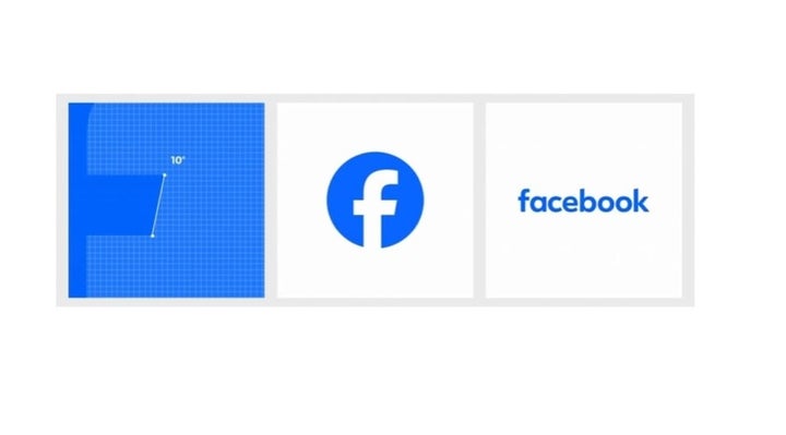
The logo is, basically, the same as the previous one, except that the blue is darker, and the lowercase “f” has some subtle tweaks. You can see the new logo alongside the most recent one in the image below.
Meta explains the changes in a blog post published on Wednesday:
“Our intention was to create a refreshed design of the Facebook logo that is bolder, electric, and enduring. Each of the new distinctive refinements drives greater harmony throughout the design as a key element of the app’s identity. To do this, we’ve incorporated a more confident expression of Facebook’s primary blue, which has been made to be more visually accessible in our app and provides greater contrast for the ‘f’ to stand out,” they explain.
I love the phrase “a more confident expression of Facebook’s primary blue.” It’s a lot of words to say that the logo is a darker shade of blue.

Why does Meta barely change the Facebook logo?
Jokes aside, it makes sense that Meta is only making slight adjustments to the Facebook logo instead of completely redesigning it.
Meta claims that the platform has an astonishing 2 billion daily active users, which means that any visual change will be seen by a large audience. I understand why Meta has chosen to make only minor tweaks to what is already one of the most recognizable logos in technology.
If you want to take a trip down memory lane, Meta’s blog post includes a short video on the logo’s history. When counting, we find that this is the fifth Facebook logo in nearly 20 years of history.
The Facebook wordmark has also been updated, according to the blog post. “Using our custom typeface, Facebook Sans, we’ve redesigned the wordmark and logo to create a cohesive treatment and improve overall legibility across Facebook,” says Meta.
There’s also a new color palette – surprisingly, it features a lot of blue – and Meta has also refined the look of reactions.
Meta has more changes in store for Facebook’s identity. The company described the updates in the Wednesday blog post as “the first phase of a refreshed identity system” for the app, so stay tuned for upcoming design tweaks… don’t miss out on them.
Journalist specialized in technology, entertainment and video games. Writing about what I'm passionate about (gadgets, games and movies) allows me to stay sane and wake up with a smile on my face when the alarm clock goes off. PS: this is not true 100% of the time.
Latest from Chema Carvajal Sarabia
You may also like
 News
NewsChina Overtakes U.S. as Leading Auto Exporter, Threatening American EV Industry
Read more
 News
NewsTesla’s Brand Reputation Takes a Nosedive to 95th Place in 2025 Poll
Read more
 News
NewsTesla Model 3 accident raises alarms over full self-driving safety
Read more
 News
NewsVolkswagen, BMW and Mercedes Are In Trouble
Read more
 News
NewsThis Persona 5 spin-off is an excellent mobile game, except for a small detail
Read more
 News
NewsApple enters the world of video games with a new app
Read more