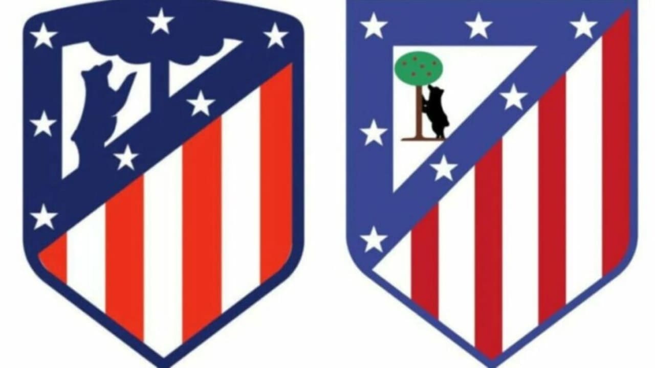
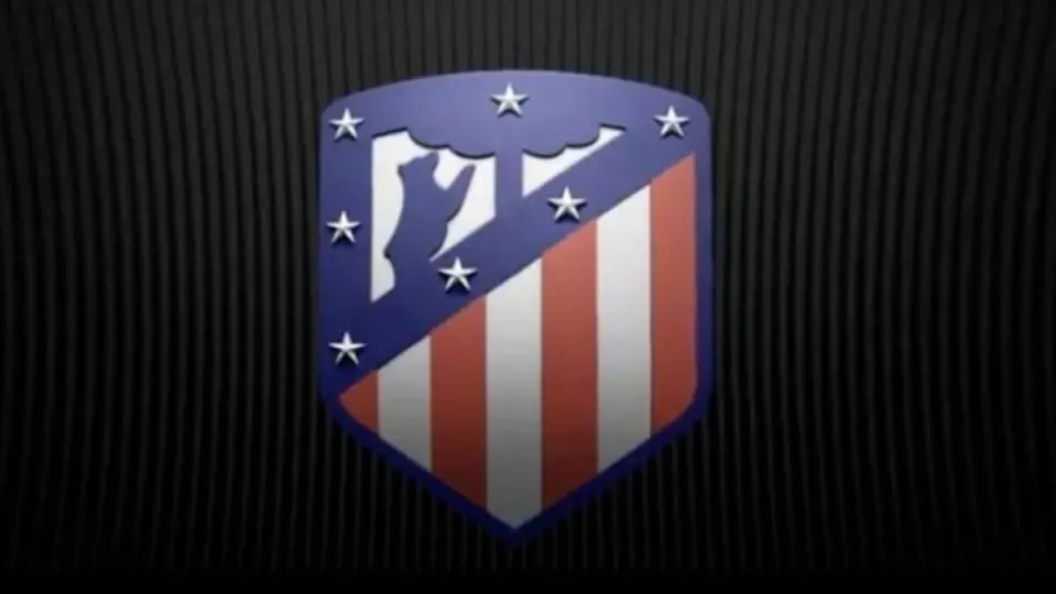
At this moment, Spain is divided between two crucial elections that will shape the course of the coming years: on one side, the general elections of June 23rd. On the other, the vote on Atlético de Madrid’s crest, which has asked its supporters whether they want to stick with the new crest adopted in December 2016 or go back to the traditional one. Seven years have passed, and what is happening may not be thrilling from a football perspective, but it certainly is from a marketing standpoint.
New Atleti
On April 23, 1985, in response to Pepsi‘s rising sales, Coca-Cola decided to set aside its classic beverage and launch New Coke with great fanfare. It was a stronger, richer flavor that had performed well in tests. The perfect replacement for the old-fashioned soda that had become outdated. The original flavor would never be sold again… that is, until the overwhelmingly negative public reaction led to a significant drop in sales, forcing Coca-Cola to announce just two and a half months later that the original flavor would return as “Coca-Cola Classic.” In 2002, New Coke, rebranded as Coke II, disappeared forever.
Something similar is happening with the crest of Atlético de Madrid. Branding experts claim that the new crest is better understood, more dynamic, and modern, and overall more visually appealing. But the fans couldn’t care less. A fundamental law of marketing has imploded, the one that states that all novelties are initially poorly received but eventually become ingrained in the collective imagination (remember the reception of “Don Limpio” as a substitute for Mr. Clean, for example).

And that’s because Atlético de Madrid had reached the point that every brand aspires to reach at some point in its life: the fans personified the crest, giving it a familiarity that it doesn’t inherently possess. Some people on Twitter are already saying that they don’t care if the new one is more visually appealing: Would you prefer your mother’s new partner if he were more attractive than your father? The crest understood as a father figure, as family, as absolute identification. It doesn’t matter if the new one comes with 100-euro bills for everyone or if the changes are minimal: the die-hard fans want what they’ve always had.
From a strictly branding perspective, the intensity with which fans are treating a choice that the management ultimately doesn’t care much about is a marketing lesson in itself. What happens when you disappoint your most fervent fans and change everything they believe in? If Netflix suddenly changed its logo to green or if Carrefour abandoned its “C” to replace it with a flower (Carreflor? Just a thought), it would cause less controversy. It’s not just about how much fans love or hate football, it’s not about a player, a goal, or a stadium: it’s about the crest. It’s the pure essence of the brand that fans are fighting for—a symbolism that goes beyond just an image: it represents everything they irrationally feel for a club. And what is more irrational than sports, after all?
Some of the links added in the article are part of affiliate campaigns and may represent benefits for Softonic.

