Article
Hands on with new Twitter for Android
- April 3, 2013
- Updated: July 2, 2025 at 8:32 AM
![]() Twitter updated its apps for Android, iOS, and mobile web today. For Android, it adopted the Holo theme and Roboto typography for devices running Android 4.0 and above. Bringing the Holo theme into Twitter for Android improves the user experience while adding quicker interactions with tweets and the various tabs for Mentions, Discover, and Me by focusing on swiping between tabs instead of tapping on them directly.
Twitter updated its apps for Android, iOS, and mobile web today. For Android, it adopted the Holo theme and Roboto typography for devices running Android 4.0 and above. Bringing the Holo theme into Twitter for Android improves the user experience while adding quicker interactions with tweets and the various tabs for Mentions, Discover, and Me by focusing on swiping between tabs instead of tapping on them directly.
The update also allows links from other apps to be opened directly from Twitter meaning you don’t have to assign permissions for different apps like YouTube or Instagram. But even with these improvements, Twitter has changed the user experience for power users who have multiple accounts. The app also has changed some interaction points, causing unwanted actions. More on this later.
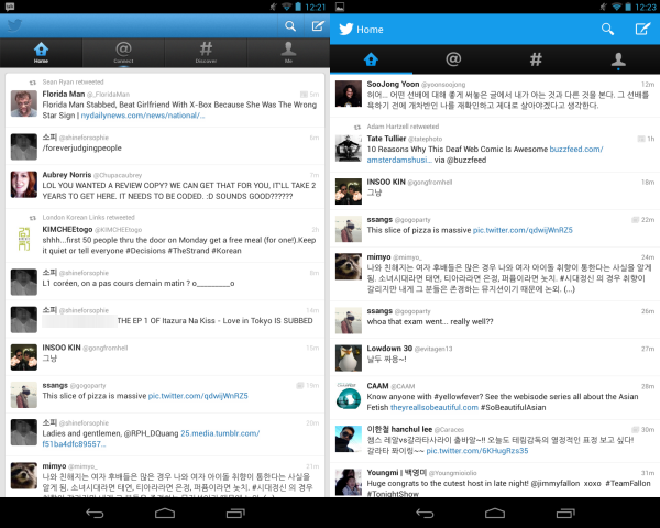
The overall design is much cleaner than the previous iteration. The top header has a flatter look and tabs have been expanded by removing the text below the icons. Strangely, updating Twitter on the Nexus 7 doesn’t update the typography to Roboto. Only the phone versions with Android 4.0+ have been updated with the Roboto typography.
Twitter’s focus on swiping has also removed swiping individual tweets for replies, retweets, and sharing. You can now tap and hold a tweet, causing it to fade and bring the menu options forward. Swiping is the primary way to move between tabs, even though you can still tap on individual tabs sections.
A big change with the Twitter update is how it handles multiple accounts. Previously you could tap the menu button and switch accounts or access Settings. Twitter removed that option and moved these options to the Me tab, which the tablet version of Twitter already supported. Now switching between accounts requires you to go to the Me tab and then choose the option to switch accounts. This adds a couple more steps, something that will quickly annoy power users who monitor multiple accounts.
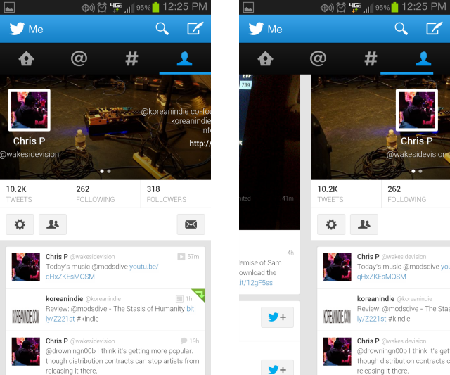
Another annoyance that may have gotten past Twitter’s quality assurance is in expanded account information. While tablets can display all the information from an account, the phone version of Twitter requires you to swipe right to another screen that displays expanded user info. Twitter on phones moved the touch interface to a vague area to the right of the profile, but didn’t really optimize the area for touch. Since Twitter is focusing on swiping between tabs, swiping left often results in moving into the Discover tab. The area to swipe to move profile information isn’t exact and gets annoying when trying to see profile info.
The visual update for Twitter on Android 4.0+ devices is welcomed because it allows for quicker access to different apps and methods to share tweets. The problem is that the new Twitter is focused on a single account by changing options for power users who are not accustomed to using Twitter on a tablet and not optimizing swipe controls on profile pages. I think there will be another quick update to Twitter to fix some of these small bugs, particularly the profile swipe which breaks the great user experience of the app.
You may also like
 News
News1 in 3 Android apps have serious API leakage issues, according to a recent study
Read more
 News
NewsThe rise of fake captchas: a new weapon for cybercriminals
Read more
 News
NewsGoogle disables the 100 results per page feature and leaves users stunned
Read more
 News
NewsThe second season hasn't even premiered yet, and Disney+ has already renewed this superhero series for a third one
Read more
 News
NewsIs Hollow Knight: Silksong too difficult? Its creators defend that it is not
Read more
 News
NewsMicrosoft teams up with ASUS to launch ROG Xbox Ally and compete with Steam Deck
Read more