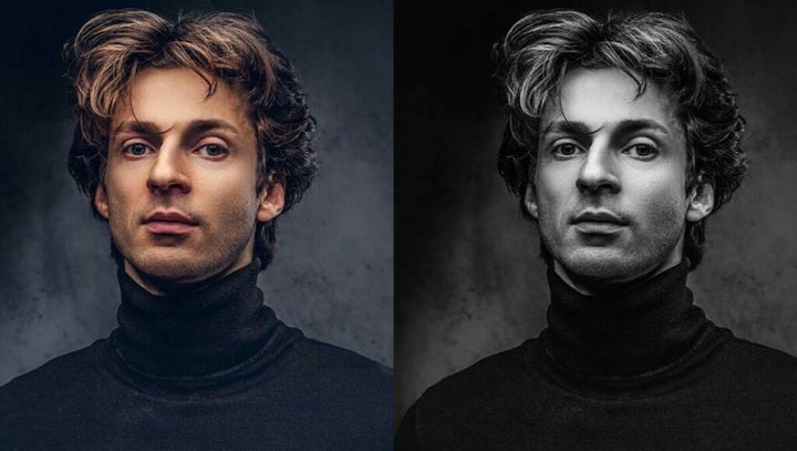
While duotone images have gained traction in recent years thanks to Spotify, the effect has a long history in design. Duotone graphics consist of at least two contrasting colors, hence the term duotone. In classical photography, the toning process entails a recoloring of grayscale images in a lab where you replace the darks and lights with two alternative colors.
Thankfully, Adobe now makes duotone image creation easy, and access to a high-end design studio is no longer necessary. All you need is Photoshop and a touch of creativity. If you’re interested in using the duotone effect to reinforce your brand with bold colors, follow the steps below.
Choosing the right image
Before creating a duotone image, you want to be strategic about which photos you choose for the effect. While Photoshop lets you apply duotone effects to any image, you’ll get the best results from high-contrast pictures.
Contrasty pictures supply you with a nice pallet of distinct dark and light tones that you can replace with alternative colors. Likewise, images with a solid background, preferably white, help establish your new base color.
If you have access to a photography studio, you can customize your background and lighting scheme to produce high-contrast images against a white background. For those shooting outdoors, photographing your subjects in the early morning or afternoon works best for boosting contrast. You can make use of light-colored buildings or utilize open horizons to establish a plain background.
How to use Photoshop’s default duotone feature
There are two primary methods of manually creating genuine duotone images in Photoshop. The first approach is to use Photoshop’s inbuilt duotone feature. Follow these steps for using the default duotone option in Photoshop:
Step 1: Create a Duplicate Layer in Photoshop
Once you’ve found the perfect high contrast image, load it into Photoshop and generate a Duplicate Layer. Right-click the photograph, select Duplicate Layer, and then press OK. Remember, duplicating your original bottom layer is always best practice because you retain an unedited version to fall back on if you make a mistake.
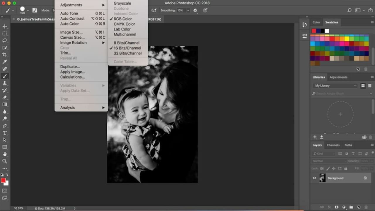
Step 2: Convert the image to 8-bit grayscale
Before you can use the default duotone feature, you must convert the photo to an 8-bit grayscale file. To do this, select the picture and navigate to Image > Mode > Grayscale. Confirm that the 8 bits/Channel option is enabled under this Mode menu. Once you’ve selected this option, you’ll encounter a few notifications asking if you want to flatten the image or merge the layers.
Feel free to merge the image if you’re already working with several layers. If not, don’t worry about it. Merging your layers gets rid of your original copy. You can skip this step, as well. The next prompt you’ll see asks you whether or not you want to discard your color information. You must delete the color information to use Photoshop’s default duotone feature, so click Discard.
Step 3: Convert the image to a duotone
Your picture is now ready to use the default duotone option in Photoshop. To enable the filter, first select your layer, then go to Image > Mode > Duotone.
Step 4: Select your colors
Since the photo is in duotone mode, you can start choosing your colors. If you check the Preview checkbox, you can see how the picture looks before you make the edit. From here, you manipulate your color settings for the desired effect.
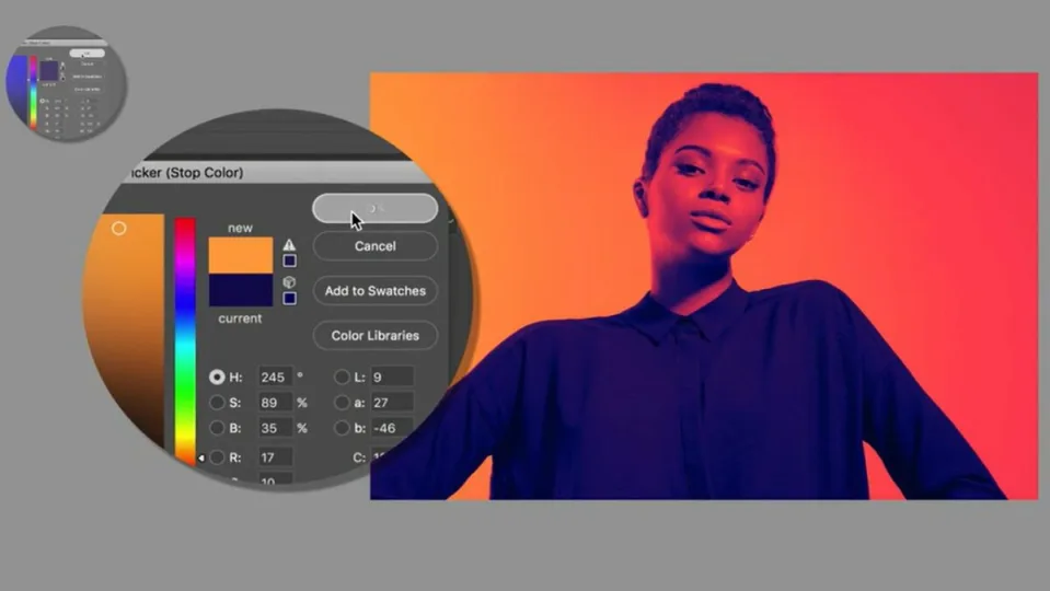
How to use the Gradient Map
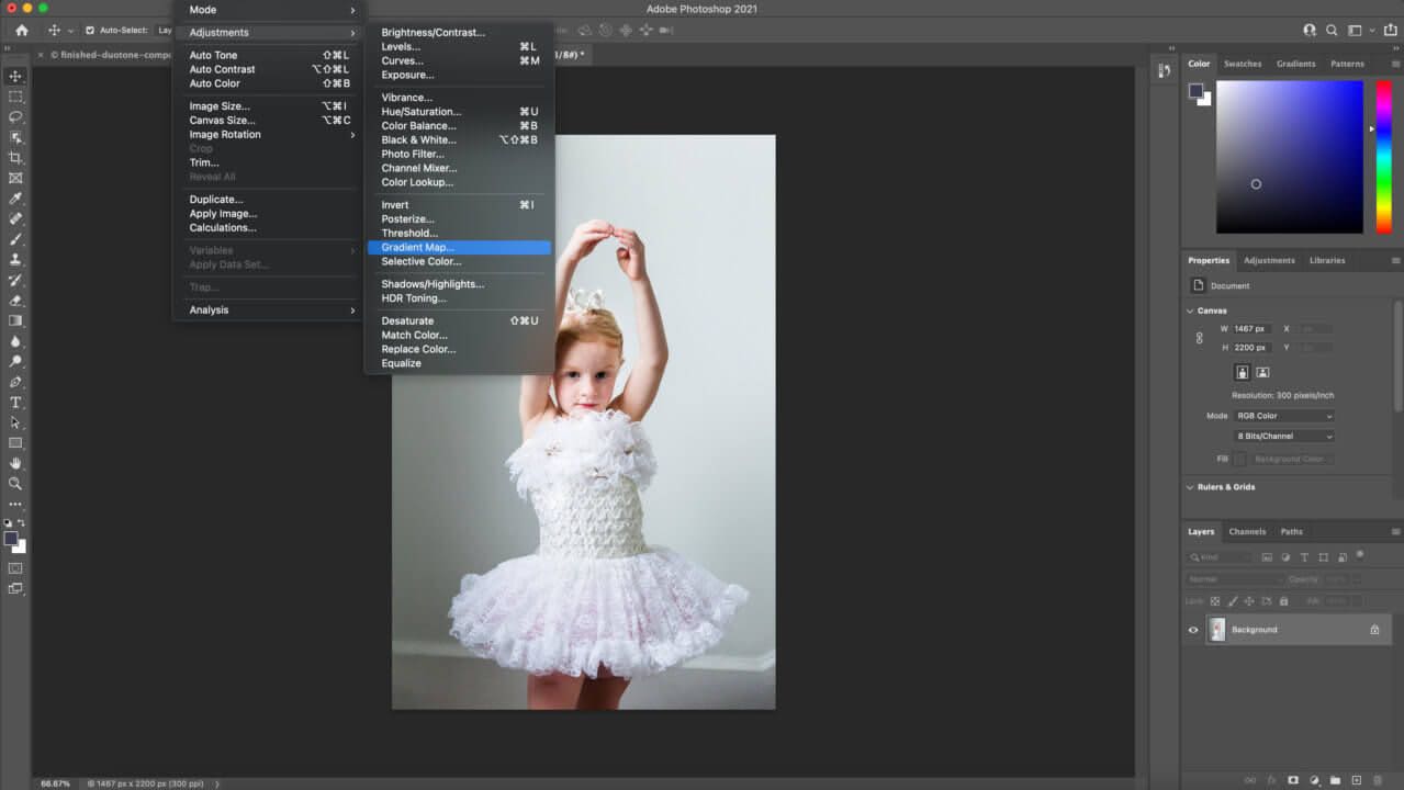
Your second option for getting duotone effects leverages the Gradient Map. This method gives you more control over your image results:
Step 1: Apply a Gradient Map
This method doesn’t require you to convert your image to an 8-bit grayscale file. Once uploaded, select the photo and scroll to Image > Adjustments > Gradient Map. This overlays the picture with a gradient for grayscale mapping. Make sure the default is set to black and white. You can invert the images by clicking the checkbox next to Reverse.
Step 2: Select your colors
When you select the gradient bar, it enables the Gradient Editor in a new window. This lets you choose from a diverse range of colors and preview how they look before completing the edit.
Compare your results
After testing the two methods, compare your results and determine which approach serves you best. You’ll find the photos look noticeably different. The Gradient Map approach is more straightforward. You don’t have to convert your file, and it’s easier to control. After downloading the Photoshop application, you can learn even more pro tips by taking Domestika courses.