Graphic Design Trends for 2025: Inclusive designs: From your idea to reality
Design for all audiences with Adobe InDesign
- January 16, 2025
- Updated: February 2, 2025 at 10:43 AM

Being inclusive when designing a project in Adobe InDesign goes far beyond what you might initially think. In addition to facilitating reading for those with vision problems, creating more readable documents will ensure that we reach a larger number of people.
Here we break down some keys that will help you create more accessible designs for all types of users with the help of Adobe InDesign.
Use accessible fonts
When we talk about accessible fonts, we refer to those that help facilitate reading for people with visual or cognitive disabilities. This means that the letters must be clear, legible, and also able to function in many different media (paper, social networks, etc.). The points you should consider are:
- Appropriate size: The smaller the letters, the less distinguishable they will be. Fonts with a proportional size will facilitate reading.
- Good contrast: The shapes of the letters should be distinct enough to be easily differentiated.
- Versatile: An accessible font should be readable even if we change its size and colors.
- Adjust letter spacing: If the spaces are too tight or too open, the words will not be easily distinguishable from each other. As a general rule, it is advised that the line spacing be maintained between 120% and 150% of the font size. For example, for a 12 pt font the line spacing should be between 14 pt and 18 pt.
Adobe InDesign has a large catalog of fonts and typefaces that you can freely use in your projects. However, this can also make choosing one among so many a real odyssey.
To save time, you can select any text from your document and preview the fonts in real time. To do this, you just need to hover over any font available from the Character panel.
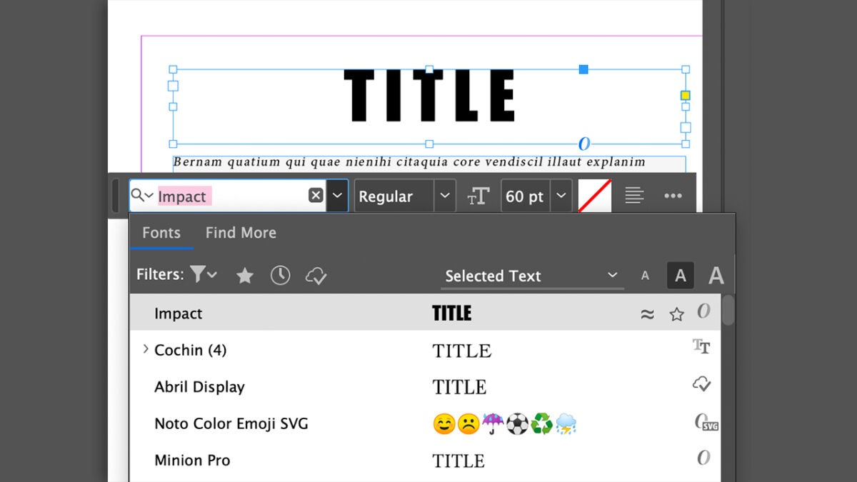
If you want to activate additional fonts, follow these steps:
- Go to the Character panel and click on Find More.
- Select the font you want to add.
- Click on the Activate icon. It is located to the right of the font.
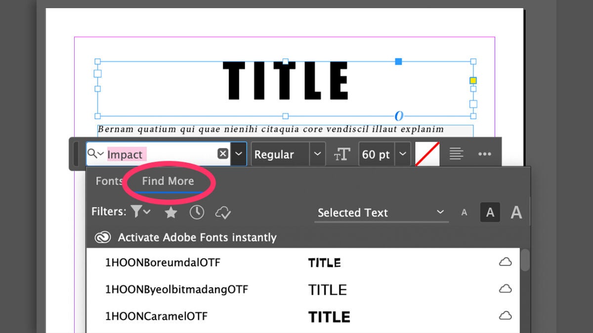
InDesign also incorporates a series of filters to display fonts according to their classification (Serif, Script, etc.), the recently added, the activated Adobe Fonts, and your favorites.
Organize your content to look its best
Using a clear hierarchical structure will be essential for the audience to understand what they are seeing or reading more easily. In the case of texts, defining the heading levels will make them much clearer visually.
In this case, the Paragraph styles tool will be very useful to facilitate the understanding of texts, add consistency, and save time. Here’s how you can do it:
- Prepare a text for each heading level. Use size and weight variations to clearly differentiate each level.
- Once you have it, select the text and go to Type > Paragraph Styles to open the panel.
- Click on Create a New Style to create a new style with the format of the text you had selected.
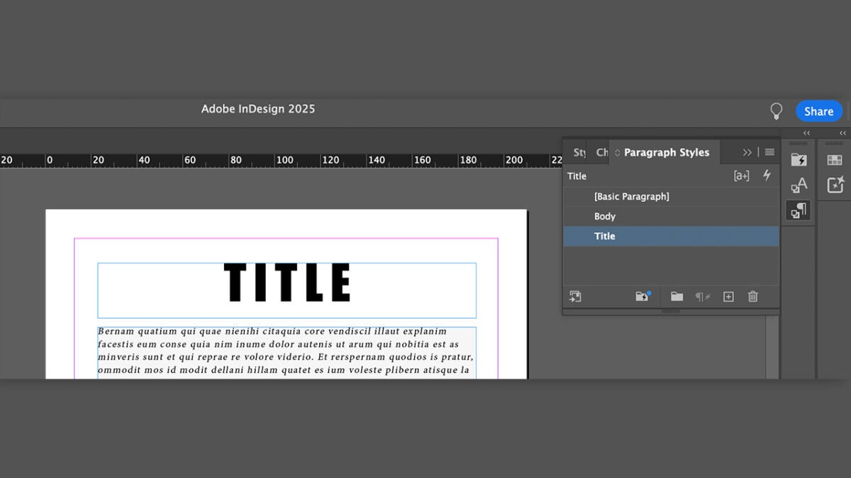
If you double-click on your new paragraph style, you will open the Paragraph Style Options panel. Here you can rename it and configure every detail of the style (font, line spacing, size, etc.)
Keep the Preview box checked so that the changes you make are reflected in real time within the paragraph.
Add inclusive visual elements
It is often said that a picture is worth a thousand words, and there’s truth to that. Adding visual resources like illustrations or photos will enhance the message of your project, making it more clear and appealing.
We can add images to our project in several ways. This is one of them:
- Go to File > Place.
- Search on your computer for the image you want to import.
- Then, you can do the following:
- Click on the page to place the image at its original size.
- Hold down the left mouse button and drag over the page until you get the size you want.
- Hold down the left mouse button while holding Shift. This will help you place the image in a frame with different proportions than the original ones.
Use colors well
Using well contrasted colors will make our texts much easier to read. However, DO NOT rely solely on color; use other elements to highlight information, such as bold.
In the case that you incorporate graphics or diagrams, for example, also use patterns or labels to convey the information. In the case of backgrounds, avoid making them too busy. Backgrounds with solid and simple colors will greatly facilitate reading and prevent users from experiencing visual fatigue.
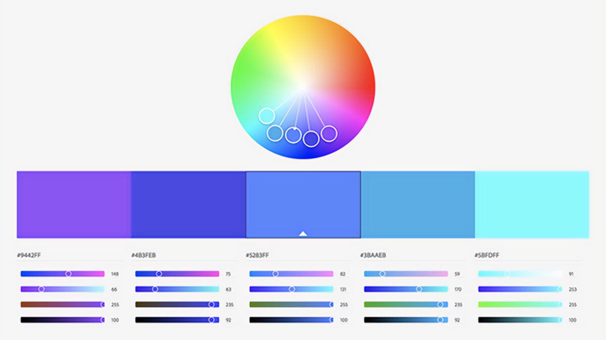
Additionally, Adobe has a tool that will be very useful for creating good color combinations, Adobe Color. From there, you can create themes, gradients, and use palettes created by the community.
Artist by vocation and technology lover. I have liked to tinker with all kinds of gadgets for as long as I can remember.
Latest from María López
You may also like

Slate Auto Unveils Electric Truck, Transforming Heavy-Duty Transportation
Read more

Dodge Charger EV Set to Transform Electric Vehicle Landscape in 2026
Read more

Starbucks opens its first 3D printed store in the United States this Friday
Read more

Tesla Insider Confidence Shifts as Board Member Purchases 4,000 Shares
Read more

Pricing for Isuzu’s D-MAX EV Expected to Exceed €36,500
Read more

Gemini could be part of Apple Intelligence later this year
Read more